
Mobile sales are ready to explode this holiday season. If you sell something, it’s still not too late to give your website a quick mobile commerce makeover.
Just as one peak selling season is winding down, we’re already preparing for the next one. Expecting to understand what consumers want—and then deliver it on short notice—is like building Rome in a day. Your end result will be shoddy, and fall short of optimal performance.
That’s why it’s more important than ever to start gearing up for each mobile ecommerce holiday season as soon as possible. This November-December holiday season, sales in general are expected to rise over last year’s totals. But even more notably, experts predict that this year nearly 70 percent of ecommerce website visits (68 percent) will come from mobile devices. And the real kicker: consumers will make nearly half (46 percent) of orders using a mobile device.
With mobile commerce or m-commerce so clearly on the rise, it’s absolutely mandatory for you to provide a great user experience to both desktop and mobile users if you want to capitalize on this uptick in online sales.
Simplicity: The key to better mobile commerce
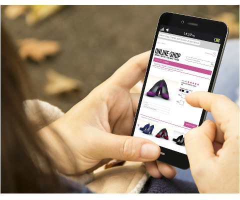 Above all, your site’s mobile commerce experience must be simple. Think about the context in which people use smartphones and tablets to browse and buy—often on the go or away from home. Few people will put up with clunky navigation or the requirement to fill out heaps of personal information before they can finish their transaction.
By the time customers reach checkout, they’re ready to wrap up the transactions that fuel and define ecommerce. But if they encounter a long form with many fields, they may abandon shopping carts altogether. It’s daunting to see one, long, unbroken screen full of fields standing between you and completing a purchase. That’s why it’s important to break the checkout process into digestible steps, each with its own screen.
As Crazy Egg writes, “Breaking up forms such as the checkout page into multiple pages that only take up half of the screen, with a clear ‘next’ button and progress indicator ensures that visitors are not intimidated to by the keyboard input entry requirements of an intimidatingly long form.”
Adding progress indicators helps reassure customers that they’re moving closer toward the end so they’ll remain in your sales funnel through the conversion stage. Limiting each checkout screen to a few fields each—like name, email address and phone number—makes the process less overwhelming on smaller mobile device screens. These measures can help reduce instances of shopping cart abandonment.
Clear, easy to follow navigation
Besides checkout, navigation is the main make-or-break factor in shoppers’ mobile experience. Many retailers opt to create a designated app because it allows them to control the user experience more closely, including navigation. But there are still ways to optimize the mobile browser experience for site visitors using a smartphone or tablet.
Your website on desktop browsers likely has a “megamenu” with sub-menus branching out depending on where users scroll or click. This is too complex for a small mobile screen—it will only leave users squinting and struggling to tap the right link rather than the surrounding ones.
Design a mobile experience that’s utterly free of clutter. People must be able to move forward and backward through landing pages and menus using only a finger. Make calls to action obvious by denoting them in a unique color, and make the buttons large enough to tap on the first try.
In sum, it’s key for you to gear up for this huge mobile ecommerce holiday shopping season, and for all shopping holidays to come. If your website still sells products that aren’t mobile commerce ready, there’s no more time to wait.