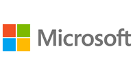
Believe it or not, it’s been 25 years since Microsoft updated its logo, and the tech giant has decided that the time is ripe — two months before it plans to launch Windows 8 and Windows 8 devices on October 26.
 “This is an incredibly exciting year for Microsoft as we prepare to release new versions of nearly all of our products,” says Jeff Hansen, Microsoft General Manager of Brand Strategy. “From Windows 8 to Windows Phone 8 to Xbox services to the next version of Office, you will see a common look and feel across these products providing a familiar and seamless experience on PCs, phones, tablets and TVs.”
Microsoft has already released preview versions of Windows 8 and Office.com, and will feature the new logo in all upcoming Windows 8 releases. Microsoft is already using the new logo online, in retail stores, and in its newest TV ads.
The new logo uses the Segoe font, which is the same font Microsoft uses in its products and marketing communications. The logo’s squares of color are intended to express the company’s diverse portfolio of products, not just Windows.
You can watch a half-minute promo for the new logo here:
What do you think of the new logo? Too safe and conservative? Just right? Or somewhere in between? Let us know in the comments below.


